As we round the first corner in the Democratic nomination race, it’s hard to miss the horse race coverage, which largely relies on”did you see this latest poll that has so-and-so within 3 points of so and so?” It can be frustrating for those of us who have worked with polls for a lot of our careers and know what they can and can’t tell us. As Kristen Soltis Anderson put it (and acknowledged she was borrowing this analogy from another very smart pollster), “polls are sometimes used to measure ounces when they’re designed to measure pounds.”
By which she means what we all know but hate to admit when we’re couch punditing: “the difference between 2 and 3 percent in a Democratic primary poll, for instance, could be just a handful of people picking up their phone versus sending it to voicemail. … People will look at someone going from 2 to 4 percent and say they are “rising” in the polls, when it could just be noise.”
So here’s a little primer on how to be an informed polling aficionado:
1. Polls can be wrong. There are a lot of steps in a poll. Writing the question, picking who to call, and weighting the answers are all big ones. As Anderson points out, there can be a “people problem” with the poll. “Sometimes it is people not giving their true preference (the “shy Tory” effect in the 90s in Britain)” or “polls systematically missing a certain type of person (missing younger or nonwhite voters in 2012 by not calling enough cell phones, or missing voters without college degrees in “blue wall” states in 2016),” as she explained.
Other times, though, it’s a problem inherent with the poll itself. Asking someone if they own a cat is a factual question: They either own a cat or they don’t. A cat owner could lie to you or forget (if they are a particularly bad cat owner,) but most likely they will report to the pollster that they own a cat.
But now ask them if they support Medicare for All. First, they need to know what Medicare for All is. As Slate noted, “[t]he phrase ‘Medicare for All’ tended to poll well early on, but its popularity tended to drop once respondents were told it would require them to give up their private insurance.” Second, they need to understand what the pollster means by “support”—support the concept in theory, or support passing legislation if it means cutting other programs to pay for it or raising taxes? Or are they just sick of health care policy in this country and think the pollster is asking whether they want to see change? This is one source of contradictions in policy polling.
Polling people on their preferences is just a tricky business—a quick Intro to Psych class or neuroscience primer will tell you that people are not always able to answer questions about their own motivations or preferences even if they want to. And yet we put enormous public policy weight into how they answer questions during a brief phone call from a stranger.
2. Statistics matter. There are roughly 246 million people eligible to vote in the United States, but a poll may sample only 1,000 of those eligible voters. The margin of error in a poll is based on a standard bell curve, which in this case can tell the pollster that there is a 95 percent chance that the sample she took represents the whole population she is trying to study in a 6-point range (or as you are more likely to see, +/-3 percent).
So what’s the problem? Hint: It’s not the math.
First, the sample poll above is looking at the universe of eligible voters. But not all eligible voters vote. In fact, only 158 million people were registered to vote in 2016 and of those, 138 million actually did vote in 2016. So the margin of error is mathematically correct, but less than 60 percent of the people sampled are going to vote come election day. Second, the confidence interval is 95 percent, meaning that 1 out of 20 times—even if you picked the 1,000 perfectly and the wording of the question is flawless—the results are still going to be outside that 6-point window. Third, a 6-point window is actually pretty large when some candidates are separated by a couple points. Or when the debate criteria provide a specific cutoff. Or when we try to read momentum mountains out of polling change molehills.
Most importantly, the margin of error is much larger for sub groups, or as a cable news pundit may call them, “cross tabs.” For example, a regular poll came out a few weeks ago that asked 500 likely Democratic primary voters which candidate he or she supported. The poll showed that 8 percent of Democratic primary voters supported Andrew Yang with a margin of error of +/-4.1%. So far so good. But then, it reported how many of each candidate’s supporters would vote for the eventual nominee even if it wasn’t his or her first choice candidate. This included the nugget that “42 percent of Yang supporters say they will not vote for anyone else as the Democratic nominee.”
See the problem? The 42 percent isn’t out of 500 people anymore. It’s out of 40 (the 8 percent of the 500 people who said they supported Yang in the initial question). That means the new margin of error is … wait for it … over 15 percent. So we can be 95 percent certain that somewhere between 25 percent and 60 percent of Yang voters may not vote for the eventual nominee.
3. Polls get reported wrong. As everyone learned on November 9, 2016, we don’t elect a president using the popular vote. And yet that’s what national polls measure. In the wake of Hillary Clinton’s stunning defeat, pollsters got taken to the woodshed, but in fact, as Anderson points out, “the national polls in 2016 had Hillary Clinton winning by around 3 to 4 points; she won the national popular vote by a little over 2 points.” A national poll with Trump winning by 2 points was further off what it was trying to measure, but because it “correctly predicted” the winner, the media reported that those polls were more accurate—even though the opposite was true.
We’ve seen this a lot in the last couple weeks. The last national poll of registered voters from Quinnipiac had Mike Bloomberg beating Trump by 9 points—a larger margin than any of the other Democrats running. But what does that actually mean? At best, it means that if the election were held last week, Bloomberg had roughly a 95 percent chance of winning the popular vote by 6.5 to 11.5 points.
But does it mean Bloomberg would be elected president? Nope, because that’s not how the poll was designed.
4. Polls don’t control for name ID. Name ID just means, “do respondents know enough about the person the pollster is asking about to have an opinion about them.” Let’s go back to the Quinnipiac poll cited above. Bloomberg is beating Trump by 9 points and Klobuchar is beating Trump only by 6 points. Bloomberg is the better bet to beat Trump in November, then, right? But wait: 44 percent of those surveyed said they didn’t know enough about Klobuchar to have a favorable or unfavorable opinion of her. If she were actually the nominee, though, almost every potential voter would have been bombarded with the equivalent of billions of dollars of media attention focused on who Amy Klobuchar is by the time November rolls around.
So asking registered voters who they would vote for if the election were held today tells a pollster only what these voters think of the candidates they’ve heard of so far. If a pollster actually wanted to try to see how the matchup would turn out in November, she would probably ask only likely voters who had an opinion about each candidate (and even then, the sample would be off because highly informed voters in February aren’t necessarily representative of low information voters in November).
Either way, it pays to factor in name ID when relying on a poll.
5. Polling averages are more reliable than single polls. It makes sense because it’s true—even if it’s less fun. More polls mean more people polled, and that means more pollsters choosing which voters to sample a little differently and deciding how to weight their results a little differently. Overall, more polls smooth out the spikes and quiet the noise of a single outlier. Want to know where the race lies? Check out the work of the great team over at FiveThirtyEight for their well-manicured polling averages.
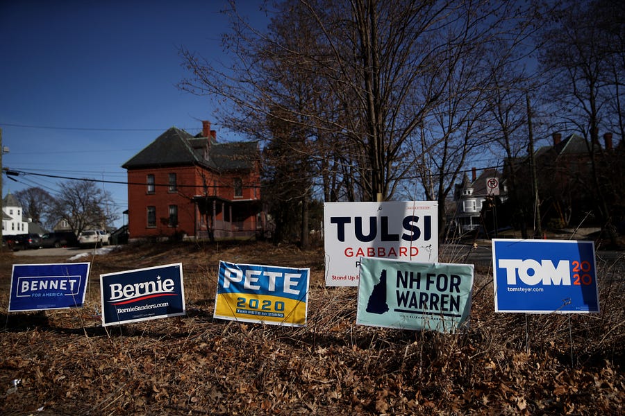
Photograph by Justin Sullivan/Getty Images.


Please note that we at The Dispatch hold ourselves, our work, and our commenters to a higher standard than other places on the internet. We welcome comments that foster genuine debate or discussion—including comments critical of us or our work—but responses that include ad hominem attacks on fellow Dispatch members or are intended to stoke fear and anger may be moderated.
With your membership, you only have the ability to comment on The Morning Dispatch articles. Consider upgrading to join the conversation everywhere.