I hope everyone had a wonderful and healthy Thanksgiving—healthy, in this case, referring to COVID-19 and not the number of sticks of butter that were used. Lots to be thankful for over here, including all of you who subscribe to this newsletter and especially the comments section, which I consume with joy every Wednesday … and it turns out the Brisket loves pumpkin.
Over the course of the week, I was thinking about the month that felt like it lasted a year in the year that felt like it lasted a decade. There’s so much data to sift through, and we’ve still got the two Georgia races to grapple with. But another thing I am particularly grateful for this season are the folks who can make all that data sing by visualizing it in new ways or just ways to help us make sense of it. So this week’s newsletter is dedicated to the seven graphics that made me stop and think the most this week.
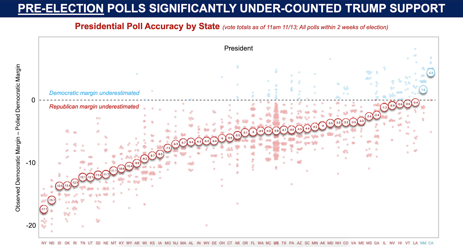
In case you didn’t notice: the polls were wrong again. This graphic highlights just how skewed the polls were against Republicans in 2020 by state. The national polls are under “US” and are just right of center. After two cycles in a row of such large misses despite assurances from polling companies, expect a lot of polling caveats from the media and pundits for the next four years. (Via Bruce Mehlman, former Assistant Secretary of Commerce for Technology Policy under President George W. Bush.)
The polarization continues and accelerates. The Wall Street Journal looked at landslide counties since 1980—places where either presidential candidate won by at least 20 points more than their national total. In 1980 (first graphic), voters in landslide counties accounted for about 4 percent of the vote share—or 391 counties nationwide. By 2016, that number had risen to 30 percent, and it was the first year there were more landslide counties than counties that were within 5 points of the national outcome. This November (second graphic), there were 1,726 landslide counties—equaling 35 percent of voters. (Via the Wall Street Journal.)


Realignment in real time. Graphics like this are good at showing the big changes—check out the southern border and southern Florida—but they also highlight how a presidential election reshuffles the deck and both the winning and losing campaigns pick up and lose support along the way. This is why I’m so fond of saying on our podcasts that when it comes to election outcomes—in stark contrast to the prevailing narrative after 2008 and 2012—the winning team didn’t do everything right and the losing team didn’t do everything wrong. Shifts in voting patterns happen over cycles slowly and then all at once when a state like Georgia flips. Remember: Oregon and Missouri were swing states in 2000. (Via BBC News.)

The ‘party of the rich’ shifts over the last 40 years. The two parties didn’t only start realigning because of Donald Trump. Since 1980, Americans living in the richest counties in America have been slowly trending away from Republicans, as rural and non college educated voters have moved heavily in their favor. Sen. Ted Cruz cited this data when he implied Republicans should change their policy priorities: “Today’s Dems are the party of the rich. GOP is and should be the party of the working class.” These are the policy changes being accelerated by the ‘Trumpification’ of the Republican Party—trade restrictions and big tech regulation being the most obvious—but the foundations for these changes were being built long before he ever thought about running. (Via Ben Winegard, Assistant Professor of Psychology at Hillsdale College.)

Stem-friendly states go blue. Based on an index that assesses states’ “capacities for generating new science ideas, as well as for commercializing technologies that contribute to firm expansion, high-skills job creation, and broad-based economic growth,” the electoral consequences of an economy increasingly responsive to STEM advances comes into stark focus. It also would tend to follow that these states have a brighter economic future while all headed in the same direction politically. Combined with the previous graphic, a picture of a new piece of the GOP coalition starts to emerge: a non-urban working class that doesn’t feel the economic benefits of the “sharing economy” driven by big tech and can no longer count on the 40 hour-a-week, 30 year jobs that their parents had. (Via Bruce Mehlman, former Assistant Secretary of Commerce for Technology Policy under President George W. Bush.)

The diminishing returns of money in politics. Campaigns and their allies pumped $14 billion dollars into federal elections in 2020—more than the money spent in 2016 and 2012 combined. Perhaps related to the graphic above as wealthier Americans turn to the Democratic Party, it was also the most lopsided election spending in recent history: 65 percent of that money went to support Democrats. And despite the outcome on November 3 for down ballot Democrats, both sides are blowing all spending records for the two upcoming special elections in Georgia. According to the Atlanta Journal Constitution, the two races have “already attracted more than $268 million in ad spending” (note: spending for the entire US Senate race in 2014 was $75 million) and we’ve still got over five weeks to go. (Via Reuters Graphics.)

117th Congress by generation. If Gen X’ers are feeling their usual sense of alienation and cynicism, they have some evidence to back them up—at least in this upcoming Congress. Despite being roughly equal percentages of the US population right now, Gen X is far less represented than Baby Boomers, who have shown no interest in loosening their grip on the seats of power. Millennials, who are currently 24-39 years old, will need to wait until they are all constitutionally eligible to be elected—25 for the House and 30 for the Senate—before they can gripe. (Via Ashley Perks at The Hill.)

There you have it. (And, look, ma! No exit polls!) Lots of stuff here for both parties to grapple with. Democrats under Biden have an opportunity to gobble up more of the ‘center’ but they risk losing enthusiasm from the progressive left. Republicans are seeing new places to build support too—the economically ‘left behind.’ I don’t think we’ll see a slow down in the money any time soon, but big donors may start becoming weary of setting their money on fire every few years. Not to worry, though, campaigns started to turn their focus away from the biggest donors in 2016. Now it’s all about convincing the true believers to part with $20-50 by targeting them with increasingly apocalyptic, fear-based messaging. And that, of course, is just a small piece of what will continue to fuel the rise of the landslide counties and negative partisanship.
Photo by Brendan Smialowski, Jim Watson/AFP via Getty Images.



Please note that we at The Dispatch hold ourselves, our work, and our commenters to a higher standard than other places on the internet. We welcome comments that foster genuine debate or discussion—including comments critical of us or our work—but responses that include ad hominem attacks on fellow Dispatch members or are intended to stoke fear and anger may be moderated.
With your membership, you only have the ability to comment on The Morning Dispatch articles. Consider upgrading to join the conversation everywhere.